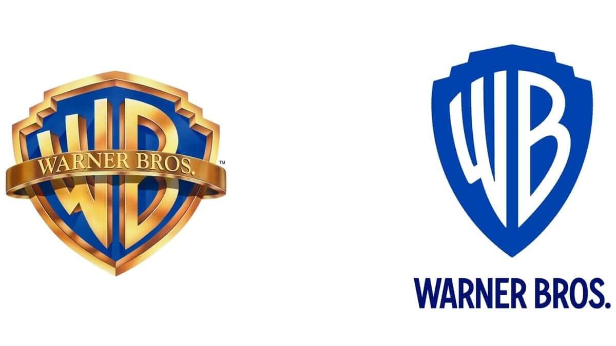
Matrix, Harry Potter, Batman…These and many others iconic blockbusters were produced by Warner Bros., a major US-based film studio. Over nearly 100 years, the company has been working relentlessly on improving its brand identity.
- Backstory and meaning
- Logo evolution
- How would Warner Bros. logo look like if it were made in ZenBusiness?
Backstory and meaning
Warner Bros. was founded by 1923 by four brothers that had come to America from Belarus which was a part of the Russian Empire at the time. The company’s first logo was a shield with massive letters WB on it. The full company name, “A Warner Brothers Production”, was placed against a beautiful scenery.
Logo evolution
In 1929, the letters expanded to the entire shield. However, the focus was shifted to the words beneath them. Also, the new design featured another company name, “The Vitaphone Corp.” which was involved in the production of sound films. This was a way to show that WB was now moving from silent to talking movies.
Five years later, the name “Vitaphone” was removed, and the emblem started to look like we know it today. Later it was decided to add a ribbon with a full brand name.
In the 60-70s, WB lived through two reorganizations and, therefore, two rebrandings. In 1967, WB was acquired by Seven Arts, Inc. and renamed into Warner Bros.-Seven Arts. On a new emblem, W was merged with 7, while B was dropped completely. In 1970, Kinney Services took over the film company and and renamed it again into Warner Communications. The overhauled emblem got back its WB abbreviation but this time the font was different and the background was striking red.
In 1984, the corporation returned to its classic, time-tested design. It featured a shield with a ribbon against the blue sky and the spectacular golden abbreviation. The logo has gone through several decades without major redesigns.
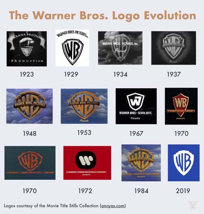
To celebrate its anniversary, WB revisited its brand identity in 2019. The new design is flat and clean, with white letters against a blue shield. Plus, the company regularly customizes its design to fit some of its most famous movies.

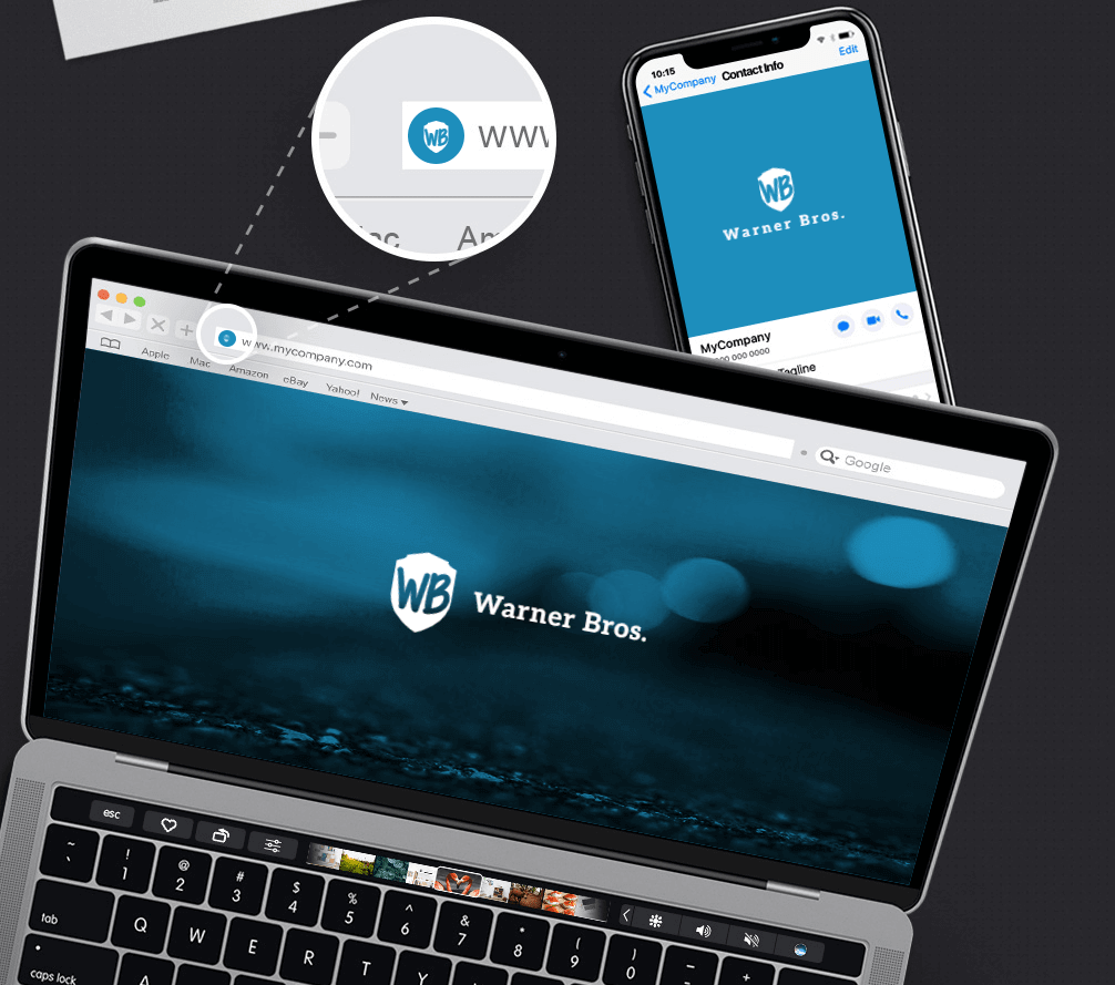
How would Warner Bros. logo look like if it were made in ZenBusiness?
Final thoughts
A consistent yet adaptive brand identity is the secret behind the tremendous success of Warner Bros. Over 100 years of its existence, the company has preserved its logo almost intact while slightly stylizing it to fit different movies. For example, the Batman version of the logo had spectacular wings. To celebrate the release of Polar Express, the design way customized with icicles. The film company pampers moviegoers with hundreds of logo variations, showcasing its passion for experiments.
Popular Brand Logos
Movie & TV Logos
