It takes an average user only 50 milliseconds to form the first impression of your website. The header is the first thing that a website visitor looks at. It’s where a user begins their acquaintance with your site. How do you make the most of your website header? What elements is it made of? What are the good examples of an effective website header? Continue reading to learn all the answers!
- What is a website header and why do you need it?
- What content to include into a header
- How to make an attractive header
- Final words
What is a website header and why do you need it?
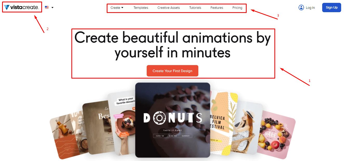
Header is the upper part of a website page. Back in the day, a header referred to a narrow part of the page that contained the website menu, contacts, and company logo. Nowadays, however, the term “header” is used to describe the entire part of the page that you see before you start scrolling down. A website header performs three crucial functions.
- Provides information. By examining the header, you can find out what the website deals with and why it’s worth checking out.
- Tells about the brand. The header uses a company logo, colors, fonts, and other graphics to forge an emotional connection with potential customers. Also, it sets the visual tone for other website pages.
- Facilitates navigation. The header features the website menu, CTA (call to action) button, and other elements that help users navigate the website with ease.
Keep in mind that you only have a few seconds to get your message over to your website visitors. That’s why you need to make sure your header features all the right elements for a proper impact.
What content to include into a header
There are no two identical headers. While some headers represent the brand as a whole, others are dedicated to a specific product or target action. When deciding what content to include into your header, think about the goal that you want to achieve. Listed below are the most common elements which are incorporated into a website header. (This doesn’t mean that you need to use them all, though.)
- Brand name and logo. These two elements enhance brand recognition and bring forward your company’s unique personality. By the way, with the ZenBusiness logo generator, creating an eye-catching emblem is just a matter of minutes! Be sure to give it a go!
- Menu. An intuitive and clear-cut menu facilitates website navigation, thus improving user engagement with the brand.
- Headline. A headline sums up the message that you want to send to your audience, e.g. your competitive advantage, promotion, etc.
- Graphics. Photos, videos, illustrations, and animations enhance the text information provided in the header.
- CTA buttons. “Buy”, “Order now”, “Learn More”, and other phrases are guiding potential customers through the sales funnel.
- Search box. A search box makes it easier to use websites with plenty of content, e.g. articles, product catalogues, etc.
- Shopping cart. A shopping cart is an essential part of any online store.
- Signup box. A signup box enables users to log into their personal accounts on the website. This feature is used by regular customers at online stores, VIP subscribers of a blog, etc.
- Social media links. It’s a surefire way to drive traffic from your website to your social media pages.
- Languages. No multi-language website can do without a language switch feature.
Here are the factors to consider when picking the right elements for your header.
- Your website type. Whether you have an online store, blog or landing page, each type of website calls for specific design solutions.
- Your goals. Your website header must urge users to perform a certain target action, thus helping you achieve your goals.
- User comfort. Your website header must only include essential information. A cluttered, chaotic page is likely to drive potential customers away.
How to make an attractive header
The visual design of a website header is made of colors, typography, graphics, usability, etc. For each of these elements, we’ve gathered smart tips and creative ideas.
Visual hierarchy
Visual hierarchy refers to arranging the elements of a website header in order of importance. For more information on the visual hierarchy technique, click here. Check out some of the smart life hacks for effectively managing user attention.
- Patterns. When scanning web pages, visitors tend to use the F-shaped and Z-shaped patterns. According to the research done by Nielsen Group, most users are giving preference to the F-shaped pattern. However, regardless of the pattern used, a website visitor always focuses their attention on the upper part of the screen. This makes a header the best place for important content, such as a company name, logo, and contact information.
- Size. Using bulky fonts and eye-catching images are the time-tested methods of grabbing the eye of potential customers.
- Colors. When it comes to website design, saturated and contrasting shades can work wonders. Also, try to stick with the same colors to make different pieces of information look connected.
- Blank space. Leaving free space around text and graphics is a surefire way to make your content stand out. On top of that, you can use blank space to visually link different elements or, on the contrary, separate them from each other.
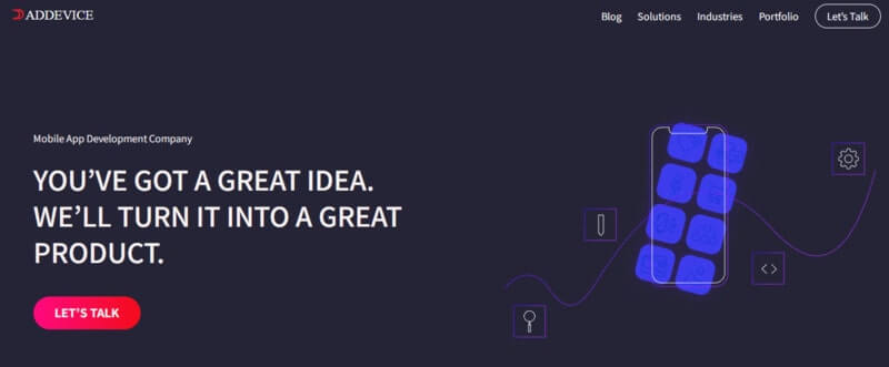
Take a look at how Addevice, a top-notch mobile app developer, is using visual hierarchy on their website. Once you open the page, your eyes instantly dart to a short headline with a selling proposition and a red CTA button. To the right, you can see a minimalist illustration. This is a great example of a straightforward and airy header.
Navigation
Simplicity is one of the main criteria of a good website menu. A menu must help users understand where on the website they’re at the moment and how to get to the right section. When working on the structure of your website menu, consider using trendy design techniques, such as:
- hover effect. When you’re hovering the cursor over a section in the menu, the subsections pop up on the screen.
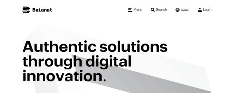
- hamburger menu. This funny term refers to three horizontal lines upon clicking on which you open the full menu. This is a great way to create a concise header that won’t distract users from other website elements. The web studio Baianat has found a clever way of using this type of menu. On its website, the hamburger menu visually resonates with the company logo which can be seen on the left.
Headline
The central element of a website header, a headline must have a compelling design and useful contents (text).
Design
Unfortunately, there is no cookie-cutter solution when it comes to choosing the right size and font for your headline. Your headline must fit your brand personality and convey the main message of your online platform. At the same time, it must not steal the thunder from the rest of the homepage. Also, you need to make sure your headline is easy to read.
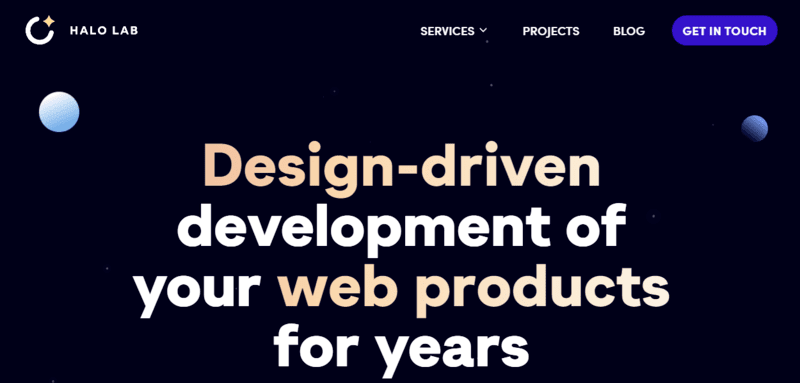
On the website for the Halo Lab digital agency, the headline takes up the entire header. However, the reserved colors and minimalist sans serif font make the headline look edgy and concise.
Text
The contents of your headline are determined by the topic and goal of your website. For example, if you have an online store, you can provide information about new products and discounts. If you develop digital solutions for businesses, it might be a nice idea to offer a free sample of software for your customers to try out. Craft manufacturers can focus on the advantages of their hand-made produce.
A headline can perform a variety of functions, e.g. urge to a certain action, evoke emotions, strengthen trust, etc.
- The renewable energy company Green Mountain Energy is using the appealing and friendly “We love your energy!” slogan. Nice play of words!

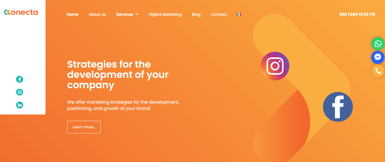
- The marketing agency Ckonecta outlines their unique selling proposal: “Strategies for your company’s growth”;
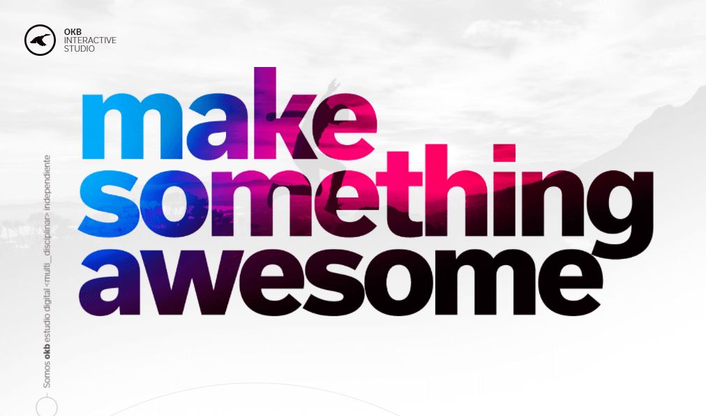
- In their headline, the digital studio Okb Interactive is sending an emotional message: “Do something cool”;
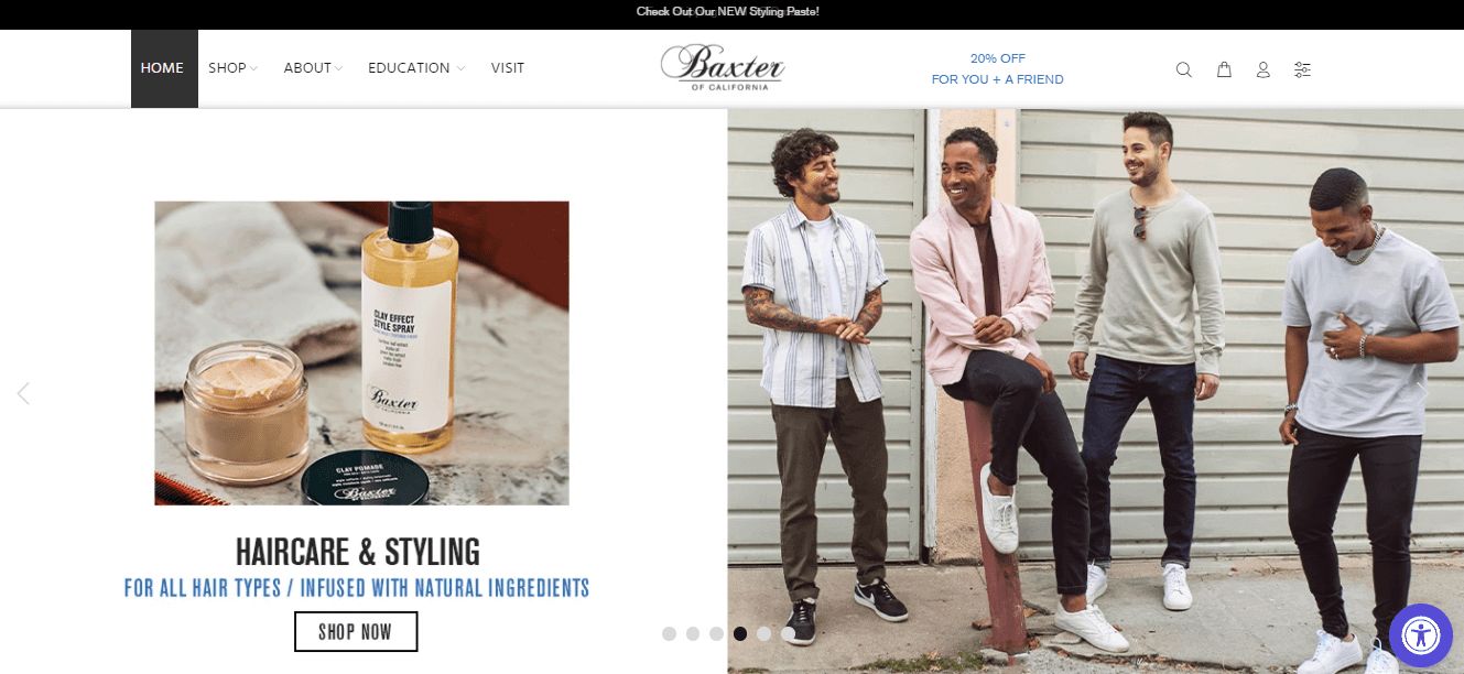
- Men’s personal care expert Baxter of California is using several headlines that feature new products, promotions, and special offers.
Graphics
Whether you’re using photos or videos, drawings or animations, your graphics must resonate with your brand message and encourage customer loyalty. We’ve outlined the things to consider when creating graphic content for your header.
- Quality. For the best result, hire a professional photographer, videographer or designer.
- Arrangement. Placing an image or a video in the center looks boring. Why not come up with a full-on slide show? On the website dedicated to the 25th anniversary of the Bad Boys movie, merch photos look like frames in a film reel. But the visual tricks don’t end there! Every time you’re hovering the cursor over an image, it transforms into a bull’s eye.

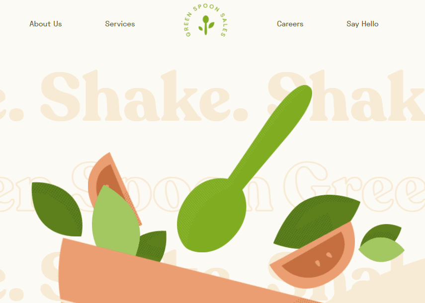
- Interactive content. Animated images are the latest trend in the website header design. The Green Spoon Sales company is using the image of colorful fruits falling onto a plate. When you’re pointing the cursor at the image, it transforms into a vibrant animation. This technique works wonderfully with the company’s “Shake” slogan!
Special effects: Sticky header and parallax
Here are two more exciting techniques that have the power to boost user experience and grab the attention of your visitors.
- Sticky header follows a visitor as they’re scrolling down your website page. The contents of a sticky header can vary depending on the type of your online platform. If it’s an online store, a sticky header usually includes a shopping cart and contacts. For a services-related website, it’s usually a promotion offer or call to action.
- Parallax refers to a compelling visual effect. When you’re scrolling down the page, some website elements are moving slower than others. The parallax technique adds a stunning 3D effect to your website, making it look voluminous.
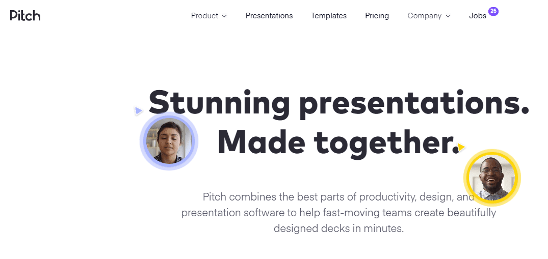
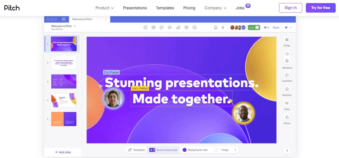
When you’re scrolling the website page for the Pitch software developer, you’re followed by a large sticky header that features the menu, CTA button, and catchy headline that says “Stunning presentations. Made together”. Also, you can click the link “See Pitch in action” to get the idea of how the Pitch software works.
Call to action
CTA button encourages a potential customer to perform a target action in order to boost your conversion.
- Your CTA button must be eye-catching. Place your CTA button where it’s easy to spot and leave enough blank space around it. Plus, be sure to use a contrasting color to make your CTA button stand out.
- Your CTA button must be clear. Come up with a clear text for your CTA button. It must be short, concise, and crystal clear.
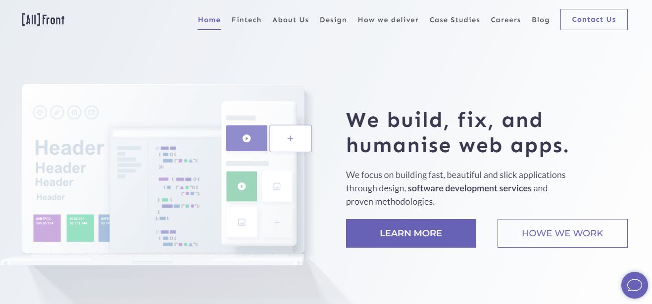
- Your CTA button must speak the language of your target audience. You don’t necessarily have to use the worn-out CTA phrases like “Sign up” or “Learn more”. For example, the All Front company that creates mobile app solutions for fintech startups, came up with a fresh way to encourage their clients to speak out: “Tell us what you need”.
Coherent design
Remember that a header is an organic part of your online platform and brand. Make sure your website header:
- fits the overall design of your website pages. Use the same fonts, colors, illustrations, etc. across all pages and sections.
- displays correctly across mobile devices. Make sure your website header looks good in the mobile version of your website.
Final words
Header is an essential element of your website and an important touch point with your target audience. Your website header must be eye-grabbing without being too into-your-face. Plus, it must be useful for your website visitors and fit the visual style of your brand. Examine the best design techniques and choose the ones that work for your website and company.


