The Best Buy is a leading retailer of electronics, appliances, video games, and other high-tech products. The signature features of the company’s identity include saturated colors and clean designs. Read on to find out how The Best Buy had managed its visual style over the years.
- First logo and change of name
- Logo evolution
- How would Best Buy logo look like if it were made in ZenBusiness?
First logo and change of name
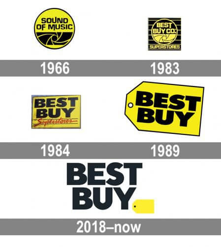
In 1966, the company opened its pioneer store, Sound of Music, which was selling stereo systems. The first logo featured a yellow and black loudspeaker. The bold color palette distinguished the aspiring brand, securing it a place in a highly competitive market.
The business skyrocketed, and the store chain was growing. Unfortunately, in 1981, the biggest store was destroyed by a devastating tornado. Following the disaster, The Best Buy launched an unprecedented sale, which turned out to be a very smart decision. In just 4 days, the company made more money than it had been making in a month. The new low-pricing model marked a new milestone in the company’s development.
In 1983, Sound of Music was renamed into Best Buy Company. The retailer expanded its range of products to include household appliances and electronics. Beyond that, it refurbished its logo by adding a new name, Best Buy Co. Superstores, to it. One year later, the emblem went through another improvement. Now it had “Best Buy” in a massive black font written inside a yellow rectangle.
Logo evolution
In 1989, the tech giant came up with a brand new concept for its stores. The new outlets were light, spacy, and stylishly designed. Customer service got a boost as well. Naturally, the company presented a fresh logo design that grew to be iconic. It featured a yellow label with the words “Best Buy” written on it.
The new emblem got nicknamed “Yellow Label”. It’s a textbook example of a simple and yet impactful design. Yellow stands for joy and optimism, while black evokes associations with high quality and elegance.
In 2018, the public saw the revamped logo. On it, the yellow label was reduced in size and placed into a lower right corner. The emblem manifests the company’s aspiration to create a clean, modern design that goes in line with modern trends. In all fairness, the logo looks great across all surfaces, including digital media.
How would Best Buy logo look like if it were made in ZenBusiness?
Bottom line
For The Best Buy, the secret behind its success comes down to a simple design and eye-catching shades. It’s amazing to see how the brand has stayed loyal to its visual identity over the years. Its loyalty paid off big time!


