- How to use autumn colors in marketing
- The trendiest fall colors of 2021
- How to create a clever color scheme for your business
- Color schemes for your inspiration
Scarlet leaves, mulled wine, pumpkin pie…Fall is bursting with vibrant hues that you can use to elevate your branding to a new level. What colors to choose? How to combine them? What tools to use to create a balanced color palette? Tap into the power of the most popular colors that reigned supreme in the fall of 2021!
How to use autumn colors in marketing
For nearly 85% of shoppers, color is the primary factor that affects their purchasing decisions. This means that businesses can use color palettes to manage the attention and behavior of potential customers.
Step 1. Look into color psychology
Psychologists have long found out that each color evokes a particular emotional response. Take a look at these autumn shades and their meanings:
- yellow and orange: openness;
- green and brown: eco-friendliness;
- shades of blue: reliability;
- wine: luxury, elegance.
Curious to learn more about color associations? Check out our articles:
- How to Create an Ideal Color Scheme for Your Website
- How to Choose the Best Colors for Your Logo
Step 2. Choose a color palette
When choosing the best colors for your brand, rely on the findings of your market research. Here are the two important factors to consider.
- Think about what you want to tell your customers about your company. Imagine that your brand is a person. Your task is to describe their personality and appearance.
- Study your audience’s tastes, interests, habits, needs, and dreams. Think about what emotions and feelings they wish to experience.
Step 3. Use your color palette in branding
Use your color scheme across as many customer touch points as you can:
- website;
- mobile app;
- socials;
- printed materials (business cards, calendars, booklets, etc.);
- product packaging;
- interior design (offline store, office, coffee shop, etc.);
- ads and commercials;
- employee uniforms.
The trendiest fall colors of 2021
Inspired by runway shows at the New York and London Fashion Weeks, the Pantone Color Institute made a list of Fall 2021’s top colors. According to the experts, these shades:
- emphasize strive for versatility;
- encourage self-expression;
- promise peace and healing;
- give off hope and joy;
- bring out closeness to nature;
- transcend creative ambitions;
- bring together playfulness and practicality.
We’ve split the colors into 3 groups, based on the autumn months. Go ahead and choose the hues that reflect the unique personality of your brand!
September
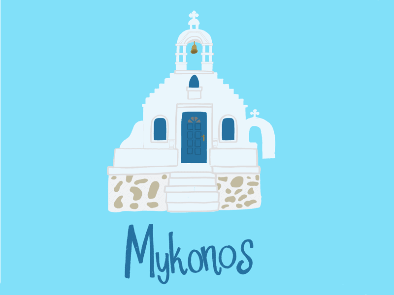
Mykonos Blue. Mykonos is a picturesque island in the Aegean Sea, Greece. The shade owes its name to the deep blue color of the waters that wash the island. Mykonos Blue gives off serene and confident vibes.
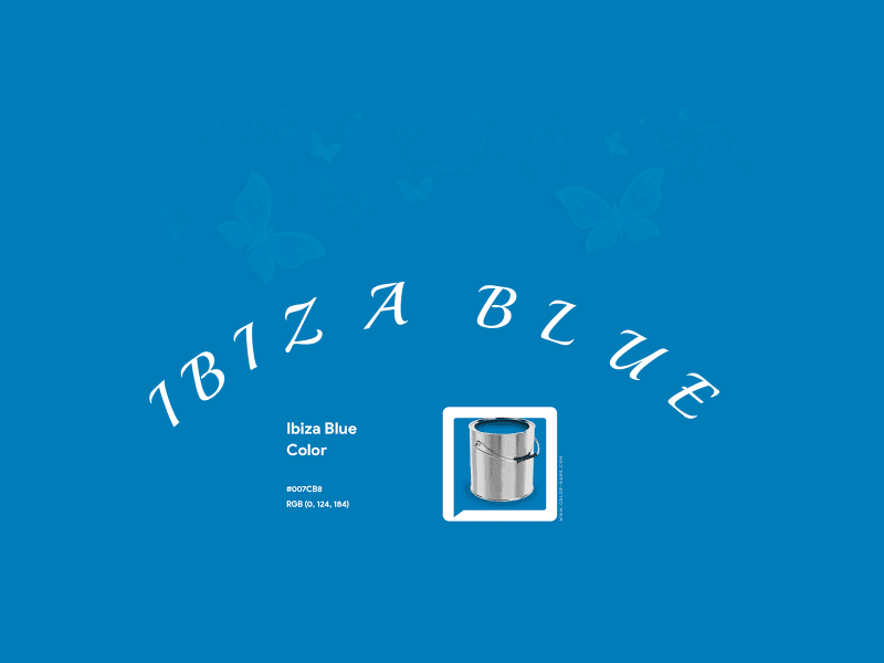
Ibiza Blue. This shade of blue is inspired by the dreamy Mediterranean sea that surrounds the famous party island of Ibiza.
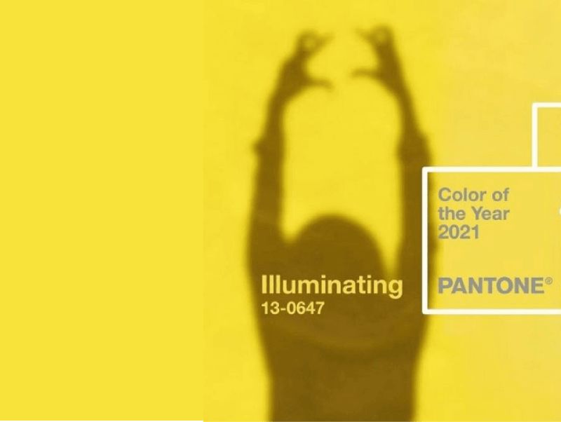
Illuminating. Yellow as sunlight, this electrifying hue emanates joy, optimism, and friendliness.
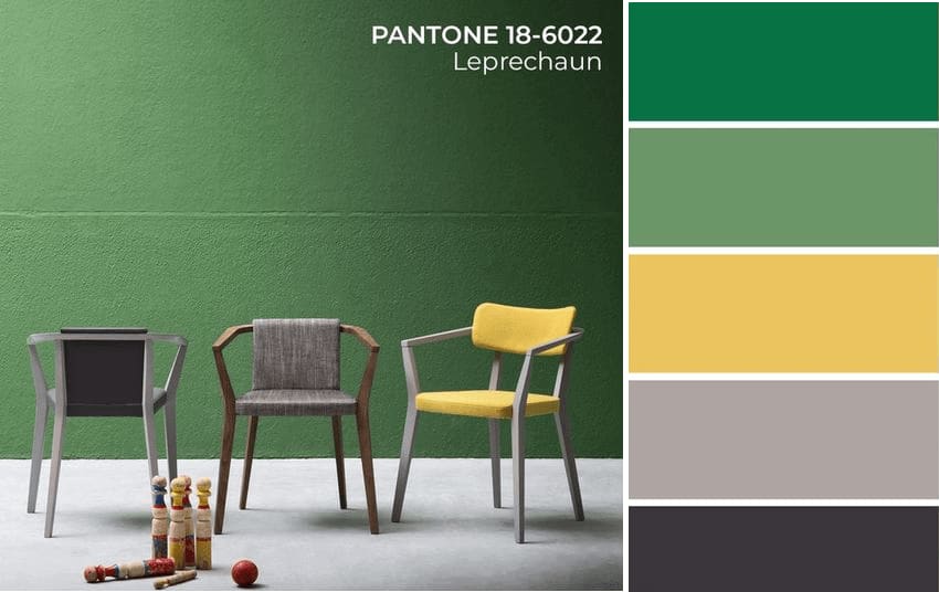
Leprechaun. Leprechaun is a mythological creature from Irish folklore. The mischievous character is often depicted wearing green, the shade that transcends a variety of meanings, such as hope, well-being, and love for nature.
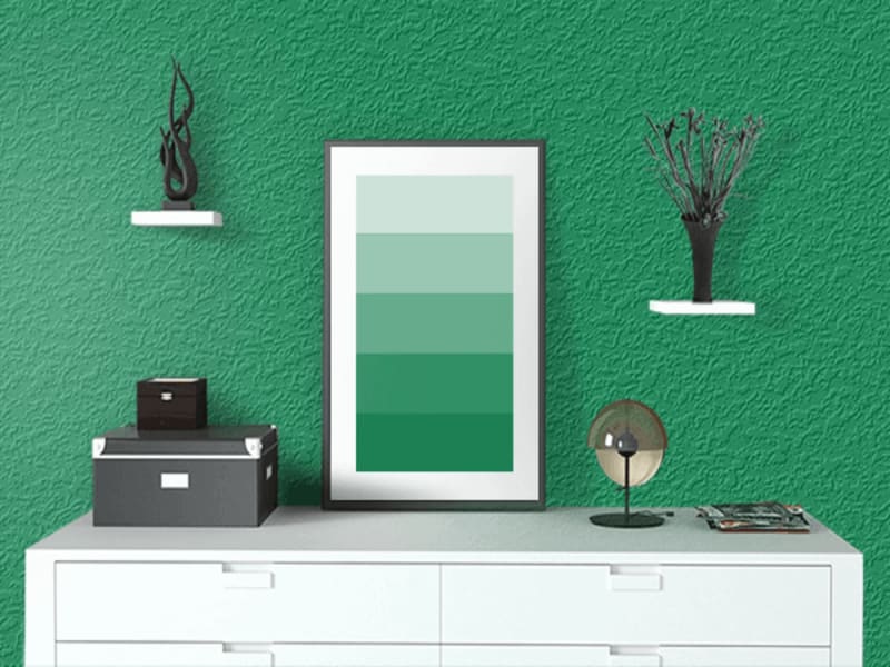
Green Bee. This refreshing shade of green stands for all things natural and authentic.
October
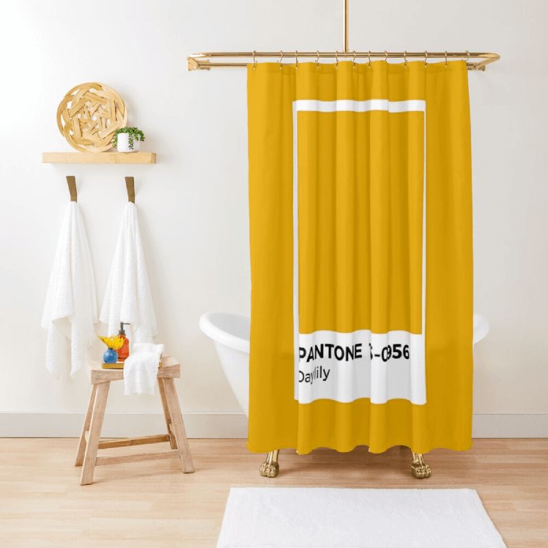
Daylily. This mild orange hue is associated with warmth and candor.
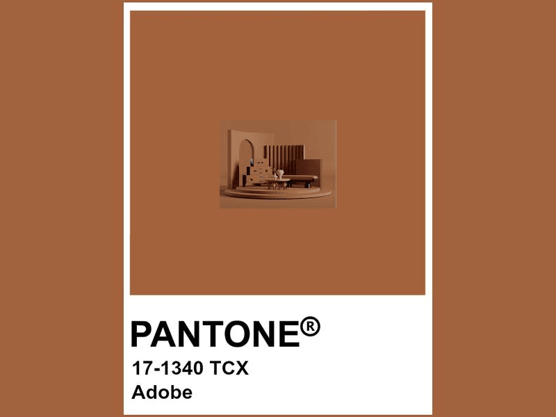
Adobe. The color of dried clay makes you feel comfortable, safe, and cared for.
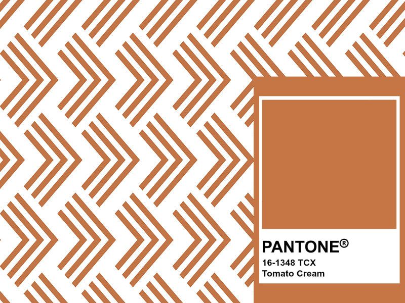
Tomato Cream. Subtle yet powerful, this muted hue of orange conveys optimism and openness.
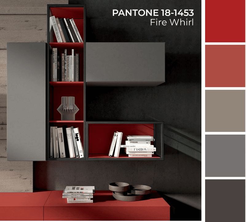
Fire Whirl. The name of this color speaks for itself! The electrifying hue stands for energy, movement, and passion.
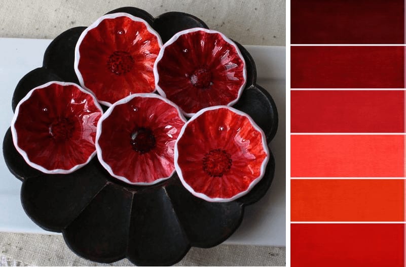
Red Alert. An alternative to the classic red, this hue is a great solution for those who gravitate toward cold shades.
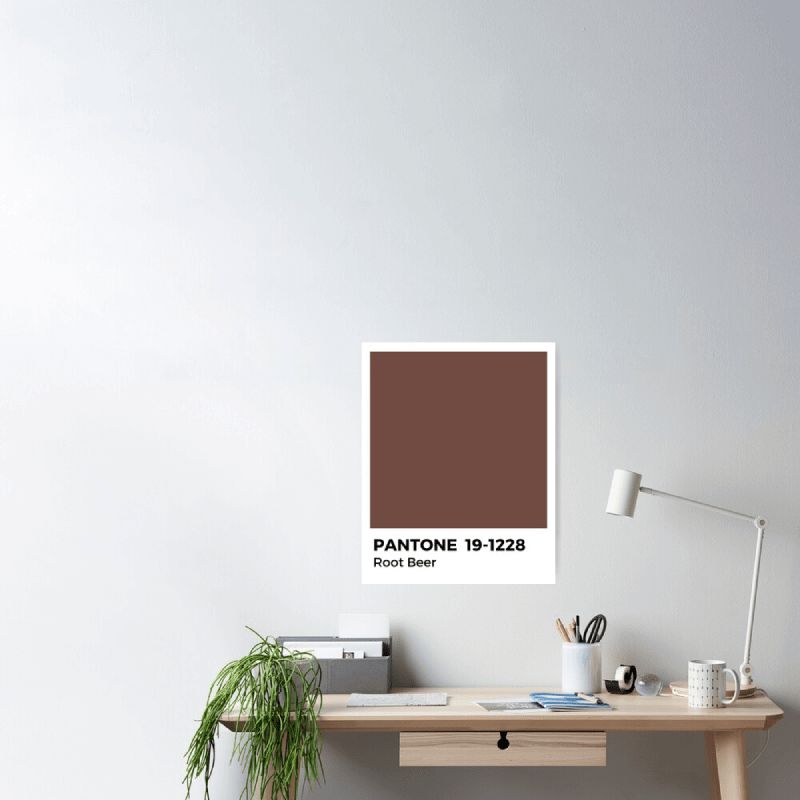
Root Beer. The Root Beer color was named after a beverage made from the roots of sassafras tree. This saturated shade of brown can help you balance a bright palette.
November
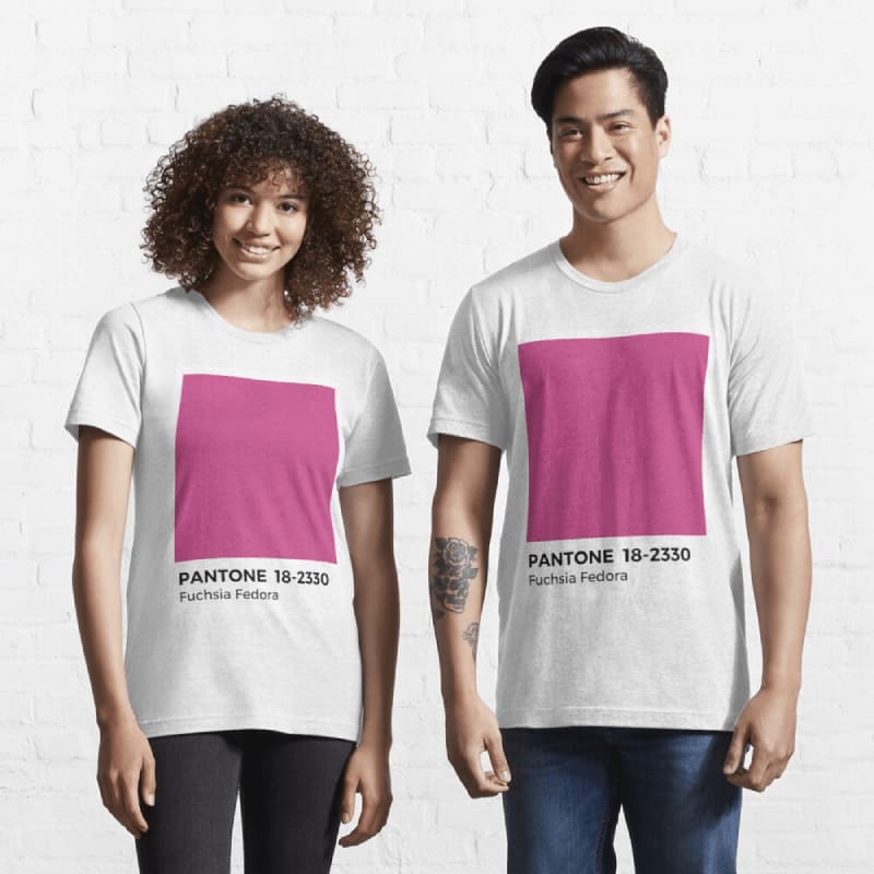
Fuchsia Fedora. This vibrant hue of pink looks daring and seductive. It’s a great choice for highlighting the bold personality of your brand.
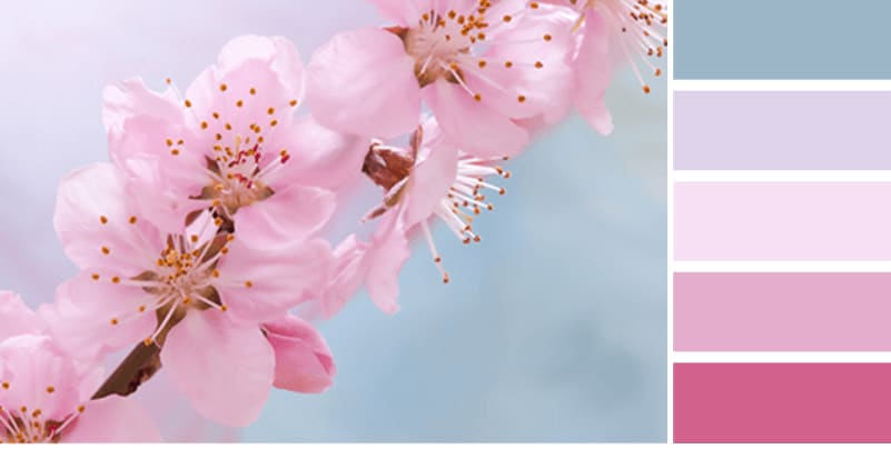
Pale Rosette. Choose this shade of pale pink to send off tender and romantic vibes.
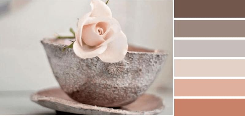
First Blush. Don’t you agree that this delicate shade of pink looks like a subtle blush on the cheeks?
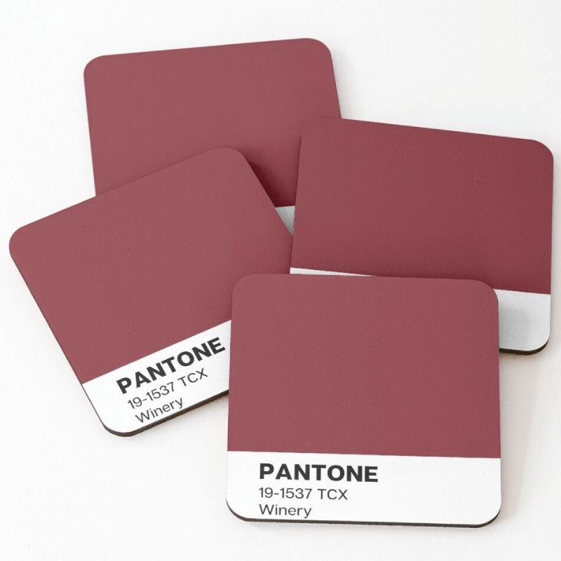
Winery. Noble and gracious, this wine color radiates serenity and elegance.
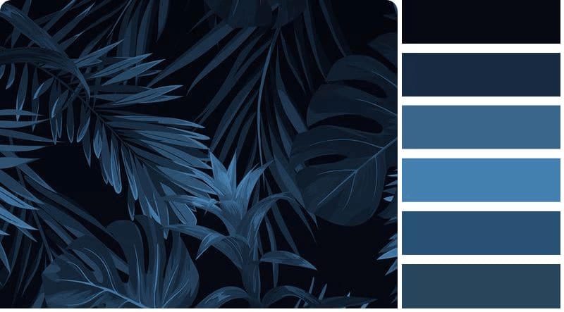
Rhodonite. This deep blue hue is a visual metaphor for nobility and luxury.
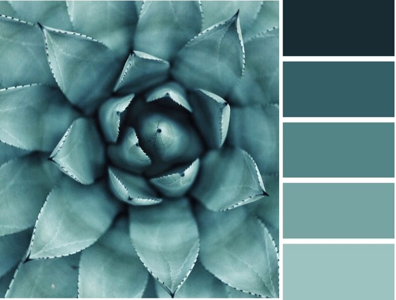
Spring Lake. This muted shade of blue is good at setting off more saturated colors.
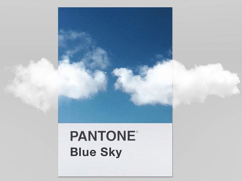
Clear Sky. Our list concludes with a refreshing shade that recalls a transparent autumn sky.
How to create a clever color scheme for your business
When it comes to crafting a smart color palette for your brand, choosing 2-3 beautiful colors is not enough. You also need to make sure they work well together to reflect your brand’s personality and send the right message to your audience.
Types of color palettes
Color wheel is a circular chart that maps colors based on their chromatic value. Depending on where a shade is found on the color wheel, designers outline 4 main types of palettes.
- Monochrome palette contains several shades located within the same sector on the color wheel. This type of palette is often used to create clean, minimalist designs. Click here to read more about monochrome color combinations.
- Analogous palette includes colors sitting next to each other on the color wheel, e.g. pink and violet, orange and brown. It works great to add depth and volume to your design.
- Complementary palette is made of shades sitting on the opposite sides of the color wheel, e.g. blue and orange, yellow and violet. This type of color scheme is good at conveying power and dynamics.
- Triadic palette includes three colors that are equally distanced from each other, e.g. green, blue, and red. This color solution emanates balance, consistency, and confidence.
Types of colors
- Main colors reveal the personality of your brand and convey its message.
- Accentuating colors serve to draw attention to the important elements that characterize your brand.
Useful tools
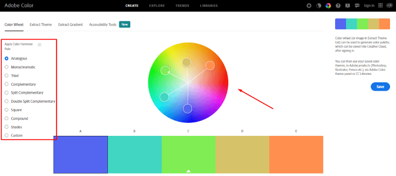
- Color wheel from Adobe Color. Great online tool that allows design rookies to create all kinds of beautiful color palettes. Pick the desired type of color scheme and move the arrow around the color wheel until you put together a nice palette. The service will automatically make matching color combinations and indicate the Pantone hex code for each shade.
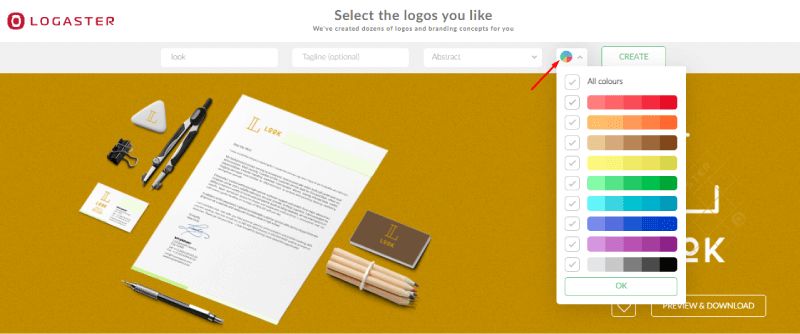
- ZenBusiness. The ZenBusiness brand identity maker will generate professional color palettes for your company’s logo, business cards, letterheads, and other designs. All you need to do is to enter your company name and select the colors that you wish to use.
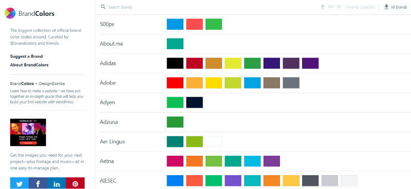
- BrandColors. The service shows you the color schemes used by the world’s major brands. Scroll down the companies (they’re arranged in alphabetical order) or use the search feature to find the brand you’re interested in. Get inspired by color choices made by the world’s most successful companies!
Need more tools? Check out our guide on 13 Best Color Palette Generators
Color schemes for your inspiration
We’ve put together a list of beautiful autumn palettes used by globally recognized companies and organizations.
Rochester Institute of Technology. The combination of black and the shade of ripe pumpkin looks vibrant and contrasting. Here orange serves as an accentuating color, drawing attention to CTA buttons, keywords, and specific tabs in the menu.

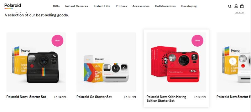
Polaroid. The company is boldly using a wide gamut of hues, including red, yellow, blue, and orange. There’s no denying that vibrant colors are the best way to showcase the advantages of cutting-edge cameras!
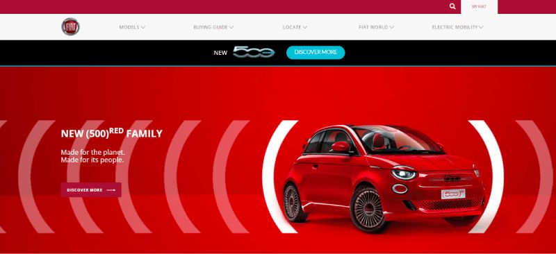
Fiat. The renowned car maker uses a clean and minimalist color palette made of black, white, and deep red.
DHL. The logistics company opted for a warm combination of red and orange. It can be seen on the DHL trucks, website, and employee uniforms. Used as an accentuating color, red highlights the vital elements that the company wants its clients to notice.

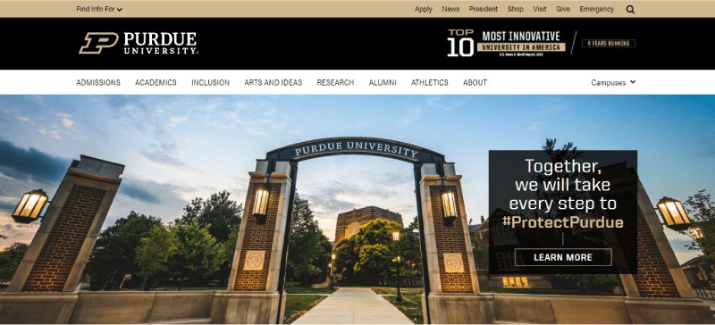
Purdue University. The unusual combination of light brown and black looks minimalist and noble, transcending the authority of the educational institution.
Grunt. The contrasting power of orange and brown works magic creating a calm, harmonious design.

MasterCard. The mild hues of red and orange convey the friendly, all-inclusive personality of the brand.

Conclusion
Fall-inspired colors have the power to craft a brand identity which is both meaningful and visually powerful. Autumn shades suit practically any business, regardless of the industry it’s engaged in. Think about what emotions and feelings you want to translate through your brand identity. Draw inspiration from color solutions used by big-name brands and craft a unique palette of your own!


